Every single day, around 10,000 Americans turn 65. That’s not just a fun fact; it’s a wave of opportunity for those in the senior insurance space. But as any seasoned marketer knows, opportunity doesn’t mean automatic success. There’s competition, lots of it.
To stand out, you need more than just solid coverage options. You must build trust quickly, speak your audience’s language, and make the path stress-free and straightforward. That’s where a remarkable landing page comes in.
You can have the best team, excellent plan options, and beautifully written ads, but you’ll struggle if you don’t have a reliable way to turn that interest into actual conversations. That’s the whole job of a landing page.
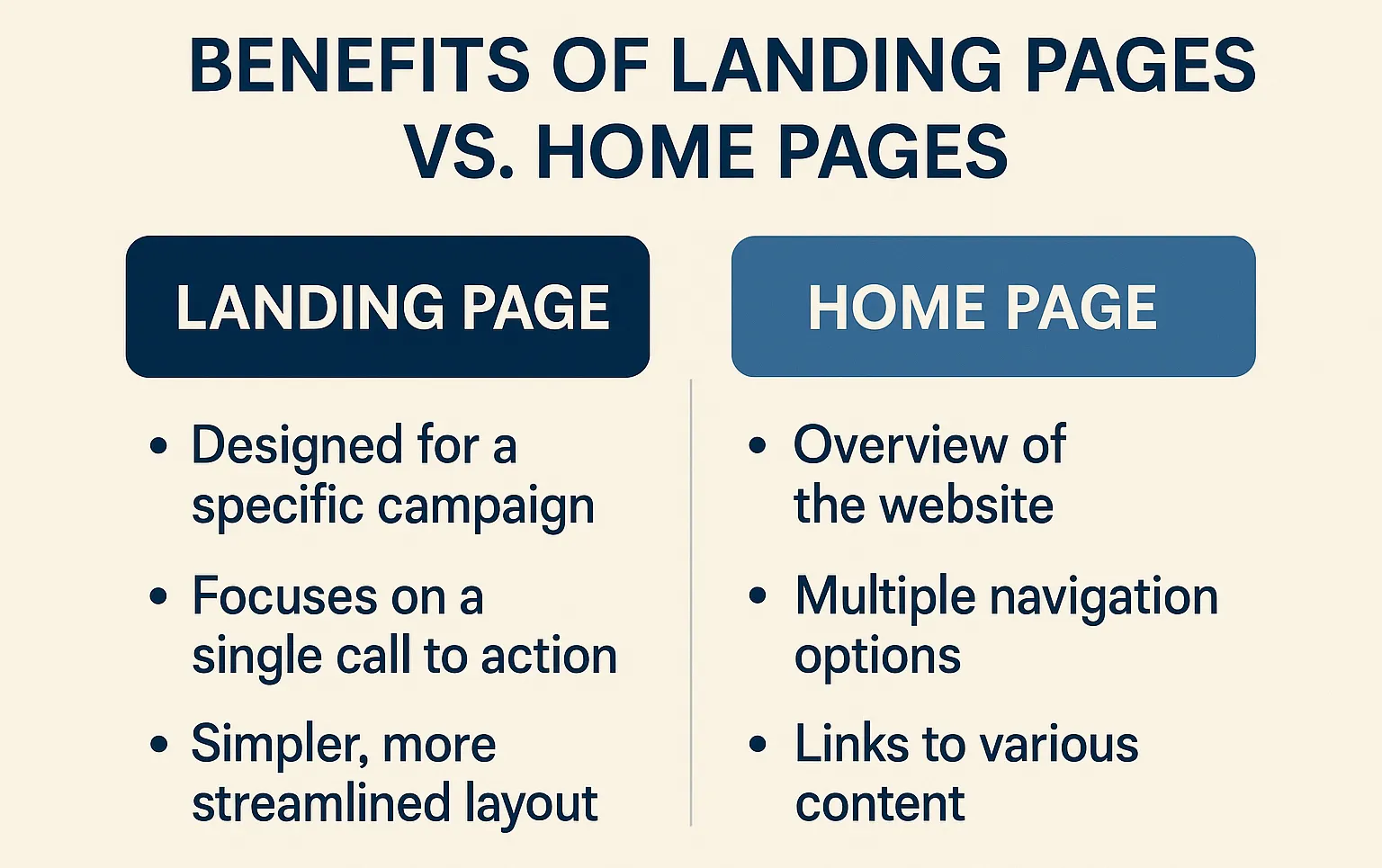
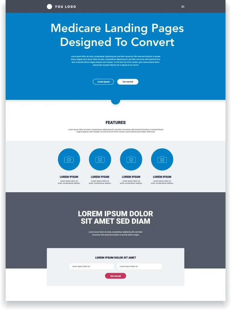
It gives people a clean, focused experience. No distractions. No guessing. Just one clear offer and one easy next step. A lot of people tend to send visitors to their homepage. The homepage has a lot of information on it, and may have several calls to action. A well-designed landing page for Medicare Insurance, directs them toward a clear call to action, like requesting a quote, scheduling a call, or downloading a free resource.
A landing page is a standalone page made for one purpose: to convert. When someone clicks on your ad or email, they don’t land on your main website; they land on a page created just for them, one message, one offer, one action.
It’s like inviting someone into a cozy office instead of a bustling shopping mall. You remove the noise and focus on what matters most. That’s especially important in senior health insurance, where clarity and timing are everything.
Your homepage has a lot of jobs, such as introducing your company, explaining what you do, and sharing blog posts or testimonials. That’s great for general visitors. But landing pages are different. They’re like your best salesperson on their best day, laser-focused on one result.
If someone compares coverage options, they don’t want to search through menus or scroll past unrelated information. They want quick, helpful answers and a clear sign that says, “Start here.” That’s the magic of a good landing page.

Not all seniors are in the same boat. Some are just hitting retirement age and feeling overwhelmed. Others are switching plans. Some are managing chronic conditions or worried about drug costs.
You can’t talk to all of them the same way, but with landing pages, you don’t have to. You can tailor your message to each group. When someone feels you get them, they’re more likely to take that next step.
The call-to-action (CTA) is where it all comes together. Whether it’s “Get a Free Quote” or “Talk to an Agent Today,” your entire page should build momentum toward that one moment. When you get that part right, conversions go through the roof.
Start with a clear and helpful headline, not clever or cryptic. “Compare Health Plans for Seniors in Your Area” works because it speaks to visitors’ wants.
Next, focus on what your audience cares about. Can they keep their doctor? Will this plan save them money? Does it make their life easier? Use plain language and stay focused on what matters most to them.
And don’t forget the mobile experience. A lot of seniors are researching on phones or tablets these days. Your page must load quickly, be easy to read, and feel as smooth on a small screen as on a desktop.
Trust also plays a huge role. Add testimonials from real people you’ve helped. Show your certifications or affiliations. Make it clear you respect their privacy and follow CMS guidelines. It’s those little touches that build considerable credibility.

The best pages aren’t always the flashiest; they’re the clearest. A clean design, a bold headline, and a strong CTA like “Get My Free Quote” can do wonders.
Some of the most successful pages offer free resources, like a downloadable “Medicare Basics” guide. That upfront value helps the visitor and shows them you’re here to guide, not just sell. And that goes a long way in building trust.

Keep Improving, One Tweak at a Time: Even the best landing pages can get better. A/B testing lets you experiment without guessing. Try switching headlines, button colors, or adding a new testimonial. Sometimes, small changes lead to big wins.
You can also personalize based on behavior. If someone clicks an ad about drug coverage, show them more about it when they return. The more relevant the page feels, the more likely they are to take action.
Make sure your page connects with your CRM, too. Every lead gets tracked, followed up with, and prioritized automatically, so no missed opportunities exist.
Trying to cram too much onto one page is a common pitfall. When seniors visit your site, they don’t want a deep dive. They want direction. Be clear and focused, and save the more profound education for after they’ve shown interest.
Another misstep is skipping mobile design or ignoring accessibility. Your page must work for everyone, including people with vision or mobility challenges. Fast load times, readable fonts, and simple layouts make a huge difference.
Color isn’t just decoration; it affects how people feel. Calming blues and greens work well because they build trust. Keep your layout open and clutter-free so the message shines through.
As for the writing, keep it natural. Use a friendly, reassuring tone. Talk like a real person would, not like a brochure. And do you have client success stories? Use them. People trust people more than they trust perfect sales copy.
What makes a senior-focused landing page convert well? Clarity, simplicity, and trust make all the difference. A strong headline, clear call to action, a mobile-friendly layout, and honest testimonials make all the difference.
Is a landing page better than a whole website for lead generation? Absolutely. A website is for exploring. A landing page is for acting. If you want someone to take the next step, a landing page gets them there faster.
Should I use the same page for all types of plans? Not if you want great results. Different plans address various needs, and tailored pages always perform better.
How do I make sure I’m staying compliant? Follow CMS rules, be upfront about your offering, and don’t overpromise. Keep your disclaimers and privacy info visible and honest.
How long should my landing page be? Long enough to answer key questions, short enough to stay focused. Give people just what they need to take action, no more, no less.